1. Fontface styles
These properties define the visual characteristics of text:
Size determines the height, in points, of displayed text.
Width determines a horizontal measure of characters (condensed, extended, etc.)
Weightdetermines the thickness of the type elements.
Bold determines whether text is normal or bold.
Italic determines whether text is normal or italic.
Example:
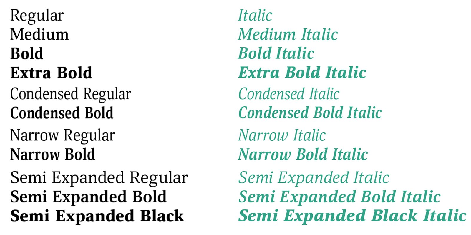 Variations of width and weight
Variable fonts
 https://fonts.google.com/variablefonts
Variable fonts enable many different variations of a typeface to be incorporated into a single file, rather than having a separate font file for every width, weight, or style.
Examples: Acumin Variable Concept, Roboto, Oswald, Hepta Slab, etc.
Common Variation Axes
Variable fonts use axes to define their spectrum of change. The five standard registered axes are:
• Weight: Ranging from thin to black (e.g., 100 to 900).
• Width: Ranging from ultra-condensed to expanded.
• Slant: Tilting the characters by a specific angle without a separate italic file.
• Italic: Switching between Roman and true italic forms.
• Optical Size: Adjusting letter details and spacing based on text size (tiny captions vs. large displays).
Video
Working with variable fonts in InDesign (2.5 min)
2. Learning InDesign - continuation
- Questions?
- Overriding parent page items
Hold down Ctrl + Shift (Windows) or Command + Shift (macOS) and click the specific item on your document page
- Re-numbering pages
Right-click on the needed page on Pages panel
Select Numbering & Section Options
Choose Start Page Numbering at and type 1
Click OK
- Simple shapes, lines (and arrows)
- Working with images and text (continuation)
Placing image into multiple shapes: select all shapes; click Window>Object&Layout>Pathfinder>Unite; then place there an image
3. Analyzing your work progress:
1. Book cover sketches discussions
My book cover example; subject - matryoshka, Russian nested doll
2. Checking page#2 – Typeface anatomy
4. Working on Cover in InDesign
Note: you might need to create outlines in some cases to work on design easier
(Due: 9/16)
1. Thumbnail sketching is a vital step in the creative process, which is especially true in graphic design.
(Therefore, I asked you to make several sketches for your brochure cover design)
Video
Graphic design sketches (2 min)
Thumbnailing is a necessity that you cannot ignore; every design project starts with this step that:
- Expresses your ideas
- Allows quick iteration over unique ideas
- Forces you to think about what you’re creating
- Gives freedom to design without worrying about technique
- Helps you to avoid artist block
- Saves you a lot of time later
Thumbnail sketching, example 1
Thumbnail sketching, example 2
2. Good and bad fonts - how to find out?


Also, google “bad fonts” and see what will happen with the browser
3. TYPOGRAPHY BOOKLET PROJECT
PART:
Typeface variations (Page 2)
Due: 9/23
(before 11:30 am)
4. LAB TIME: WORKING IN CLASS ON THE PROJECT
Meanwhile, I will be checking and grading your Anatomy of Letterform Diagram page from the dropbox
9/21 - no class
STUDY
Sketchbooks
Importance of sketchbook for designers
- It is your personal space, you can do whatever you want within those pages, no client expectations.
- You can keep a collection of visuals that inspire you
- Helps with your creativity: the more you fill the pages of your sketchbook and flex your creativity muscles, the easier your ideas and imagination will flow.
- It is a great way to keep my drawing skills sharp
- Working on sketches strengthens your focus and strategic thinking.
And much more
Inside the sketchbook – working with logos
16 Famous Designers Show Us Their Favorite Notebooks
Video
Thumbnail sketching (2 min)
Video
Importance of sketchbook for designers
Good/Bad fonts
Good and bad fonts - how to find out?
Video
Good/bad fonts
Worst Fonts
DO & SUBMIT
Typography Booklet Project
1. Finish and submit the part Typeface Variations for a grade
2. Correct, finish and submit the Cover part for a grade
Reminder: submission before 11:30 am 