1. Class general info overview
- Syllabus
- Class website
- Grading policy
- Class Rules
2. Typography
Video
Graphic Design and Typography short overview (6 min)
History of Typography
Typography is the art of arranging type to make written text readable and aesthetically appealing for the reader. It is used to communicate a feeling, a message or an idea.
Illuminated manuscripts
Illuminated manuscripts were hand-made books, initially produced by monks in Western Europe between the 5th and 13th centuries. They are so called because of the use of gold and silver which illuminates the text and accompanying illustrations.
The most popular type was the Book of Hours which were Christian prayers to be said at certain times throughout the day.
Video
The process of creation (3 min)
Their production gradually died out after the invention of the printing press.
Video
A Brief History of Type (11min)
Note: Linotype vs monotype:
Linotype - typesetting machine by which characters were cast in type metal as a complete line
Monotype - typesetting machine that produced type in individual characters, which are assembled into lines in a fashion similar to classical movable type.
3. Typeface
Typeface (or Type Family) vs. Font
A typeface is the name of a specific collection of related fonts; it is a family of fonts, where each font has a different style.
Font refers to a particular weight, width, and style within that typeface.
For example, Arial is a typeface, but Arial Bold, Arial Narrow and Arial Regular are all fonts of the Arial typeface.
Type Classifications

-
Serif: Typefaces with a small line or stroke regularly attached to the end of a larger stroke in a letter or symbol
Examples: Times New Roman, Garamond, and Georgia, etc.
-
Sans-serif: Sans means without. These typefaces are devoid of those small extensions, hence without serif. Examples include Gill sans which has Humanist connotations, Helvetica with its transitional characteristics and so on.
-
Script: Letter forms developed in close relation to human handwriting are script typefaces. They are flexible in nature with varying stroke widths.
Example : Bistro Script, Shelly, Minstral etc.
-
Blackletter: A bold script style of calligraphy used heavily during the renaissance.
Example: Fraktur
-
Decorative: Typefaces which do not fit in other categories are decorative in nature. Built for specific use cases which largely consist of headlines, posters etc.
-
Monospaced font, also called a fixed-width, or non-proportional font, is a font whose letters and characters each occupy the same amount of horizontal space
Monospaced fonts are customary on typewriters.
See image
Serif classifications
There are four major classifications of serif fonts: old style, transitional, modern (didone, classical, neoclassical), slab-serif (Egyptian)
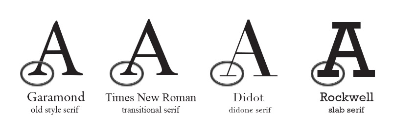 Typeface vs. font
-
Typeface: The core artistic design, style, and visual identity of characters; they have different names, for example, Helvetica or Georgia).
-
Type Family: The overarching group that houses every variation of a typeface — such as light, regular, bold, italic, and condensed— built from that same design
-
Font: An individual specific design style, for example Helvetica Bold Italic
4. Learning InDesign - beginning
- creating new documents with custom margins
- exploring the workspace
- managing panels
- adding new pages
- master page
- adding text
- placing and adjusting images
- and more
1. Famous art styles from the beginning of the 20 Century, and their font faces
These font faces became very popular today.
Art Nouveau - an international style of art, architecture, and applied art, especially the decorative arts, it was most popular between 1890 and 1910. It was characterized by the ornamental style of art, with its organic, asymmetrical, intricate and flowing lines.
Example 1
Example 2
Example 3
Example 4
Bauhaus was a German art school operational from 1919 to 1933 that combined crafts and the fine arts. This style emphasized boldness and abstract, yet structured creativity
Example 1
Example 2
Art Deco was about finding beauty in geometric simplicity, combined with elongated letters and vertical decorative line details.
First appearing in the 1920s and 30s, Art Deco made a comeback in the 1970s and 80s as well.
Almost by definition, Art Deco meant sans serif type. (for ex. Avant Garde, Futura, Kabel)
Example 1
Example 2
2. Type Anatomy
3.Type Measurements and Spacing (Leading, Kerning, Tracking)

1 inch = 6p0 = 72 pt
1p0 = 12 pt
- Points are traditionally used in print media
- Pixels are fixed-size units that are used in screen media
- “Ems” (em): The “em” is a scalable unit that is used in web document media.
An em is equal to the current font-size, for instance, if the font-size of the document is 12pt, 1em is equal to 12pt. Ems are scalable in nature, so 2em would equal 24pt, 0.5em would equal 6pt, etc. Ems are becoming increasingly popular in web documents due to scalability and their mobile-device-friendly nature.
Leading - space between lines of text
Kerning - space between two alongside letters
Tracking - space between all letters in a word
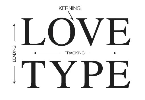
Practice kerning: Kerning Game
Just drag the letters (except the first and the last) so the distance between each one would look approximately equal. Then Click Done button. (You can refresh the browser to work on the same word again.
It is not easy at the beginning, but we have to train our eyes.
4. Learning InDesign - continuation
