working with type
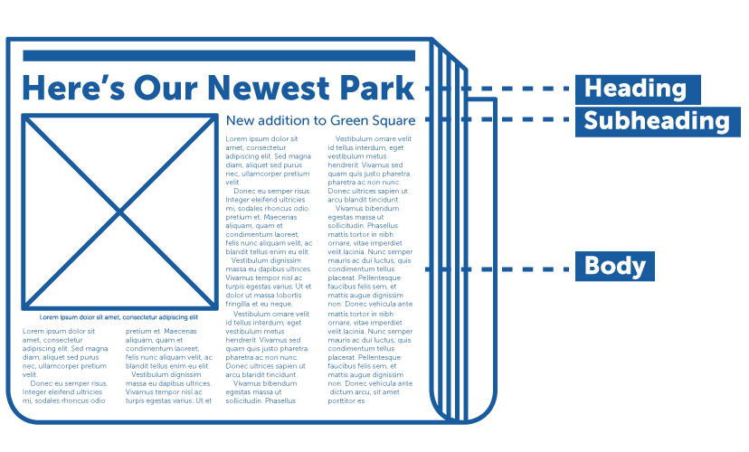
Do not forget about hierarchy of information
Do not use: Comic Sans, Curlz MT, Brash Script, Monotype Corsica, Bradley Hand ITC,
Kristen ITC, Viner Hand ITC, Papyrus and similar 100-years-old typefaces
(Times New Roman and Arial – only for body text)
What fonts not to use?
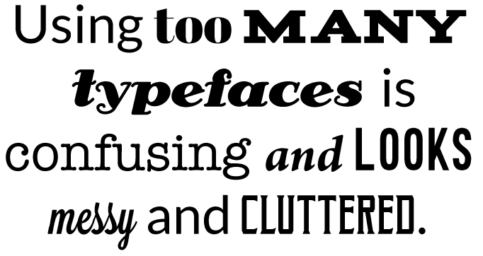
Do not use more than 2 different typefaces (exception – 3, but very carefully), unless it is a special typographical poster.
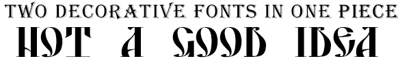
Do not use 2 different decorative typefaces (one can be decorative and the second – traditional)
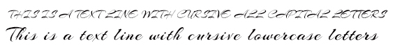
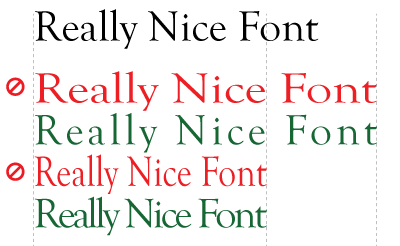
Do not use all capitals in cursive fonts
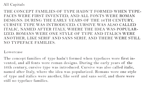
Do not use all capitals in body text
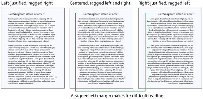
Do not use centered aligned or right aligned text for the body copy
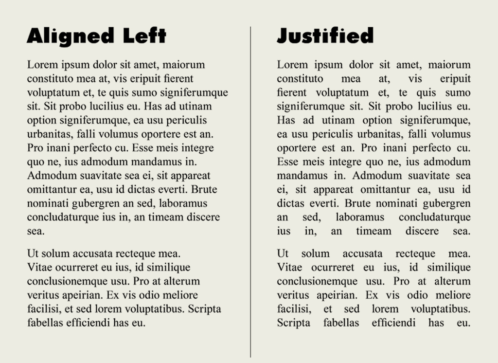
Avoid using justified text for the body copy.
Do not distort/stretch font (better use tracking)
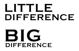
Do not use little difference in font sizes, for example headline and subheads (make one at least 2-3 times bigger than another)
Do not use many colors and especially gradients
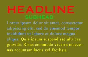

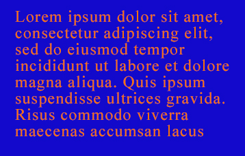
Do not use complimentary colors for the text and its background
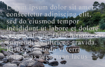
Do not put the text on a busy background (make it readable)
Do not apply layer styles such as Bevel and Emboss, Glow and unnecessary shadows
without a very special reason (and if you do, then very carefully)

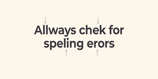
Do not neglect the grammar, syntax and punctuation
Do not forget to take care of the font-face (you have to consider opening your file on another computer):
- Do not forget to apply CREATE OUTLINES command to the text in Illustrator
- Do not forget to rasterize the text layer in Photoshop